
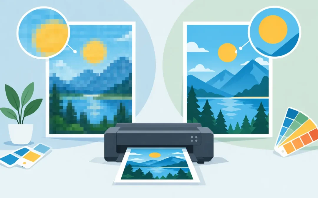
A blurry logo on a retractable banner, jagged text on a storefront window graphic, or a postcard photo that prints soft can all trace back to one decision made before the file was uploaded. Raster versus vector graphics is not a design-school technicality. It directly affects how sharp your marketing looks, how large it can print, and whether production moves quickly or pauses for file fixes.
For business owners, event teams, restaurants, real estate professionals, and agencies, the goal is simple: send artwork that produces a top-quality result the first time. The right format depends on what is in the design, how large it will print, and how close people will stand when they see it.
Raster Versus Vector Graphics: The Core Difference
Raster graphics are made from tiny colored squares called pixels. Every digital photograph is raster-based. When you zoom in far enough, those pixels become visible. Images from a phone camera, product photos, scanned artwork, and many web graphics are common raster files.
Vector graphics are built from mathematical paths, points, curves, and shapes. Instead of storing a fixed grid of pixels, a vector file describes the object itself: where a line starts, how a curve bends, what color fills a shape, and how thick a stroke should be. That is why a vector logo can be scaled from a business card to a building sign without becoming blurry.
The practical difference is scale. Raster files have a set amount of image information. Enlarging them beyond their intended size stretches the existing pixels. Vector files recalculate their paths at any size, keeping edges clean and text crisp.
Neither format is automatically better. A high-resolution photo belongs in a raster format. A logo with clean type and simple shapes should usually be vector. Most polished print files, especially brochures, posters, and catalogs, contain both.
When Raster Graphics Are the Right Choice
Use raster artwork when the image depends on photographic detail, natural textures, gradients, shadows, or complex color variation. Think menu photography, hotel interiors, food close-ups, staff portraits, real estate images, and product shots. A vector version of a photograph would not preserve the visual detail that makes the image persuasive.
For standard printed pieces viewed at close range, raster images should generally be supplied at 300 pixels per inch at their final printed size. A 4-by-6-inch postcard photo needs enough pixels to print clearly at 4 by 6 inches, not merely enough to look good on a phone screen.
This is where many urgent jobs run into trouble. A customer downloads a logo or photo from a website, where it may be only 800 pixels wide, then places it across a 24-inch poster. It can look acceptable on a monitor but print noticeably soft. Screens display images at a much lower resolution than commercial print requires.
Raster files are commonly saved as JPG, PNG, TIFF, or PSD. Each format has a role. JPG files are convenient and compact, but repeated saving can reduce image quality. PNG files support transparent backgrounds and work well for digital use, though they are not always the best choice for production. TIFF and PSD files can retain more image data, but they may be large. A print-ready PDF can also contain raster images.
When Vector Graphics Give You the Advantage
Vector graphics are the production standard for logos, icons, illustrations, line art, maps, lettering, and simple branded shapes. If your company mark needs to appear on business cards, letterhead, presentation folders, vehicle magnets, banners, acrylic signs, and trade show displays, keep an approved vector version on file.
The most common vector formats are AI, EPS, SVG, and PDF. For commercial printing, a properly prepared PDF is often the easiest file to submit because it can preserve vectors, fonts, images, trim settings, and color information in one package. EPS and AI files are also valuable source files, particularly for logo management and design revisions.
Vectors offer another major benefit: editable color and shape control. A production team can more easily apply a spot color, adjust a line weight, update a phone number, or resize a logo without rebuilding the artwork from scratch. That matters when a last-minute event banner needs a new date or a real estate sign needs updated contact information.
Text should remain vector whenever possible. If text is converted to outlines, it becomes a graphic shape and avoids missing-font problems. If it remains live text in a PDF, embedding the fonts is essential. A logo copied from a screenshot is never a replacement for original vector artwork, even if it appears sharp at a small size.
Print Size and Viewing Distance Change the Answer
The 300 PPI guideline is ideal for close-viewed materials such as postcards, brochures, booklets, and business cards. Large-format pieces are different. A banner viewed from several feet away does not always need the same pixel density as a pocket-sized flyer held in someone’s hand.
That said, “large format” does not mean any low-resolution image will work. A 72 PPI web image is rarely suitable for a large banner, window graphic, or wall display. The effective resolution at final size matters. If a 3,000-pixel-wide image is printed 10 inches wide, it has far more usable detail than if it is stretched to 50 inches wide.
Viewing distance, substrate, and design all affect the acceptable range. A step-and-repeat backdrop with a repeating vector logo can scale beautifully. A photo-heavy event backdrop needs enough resolution to look clean from the expected viewing distance. Window graphics may need high-impact visuals rather than tiny photographic details, especially when people see them from across a sidewalk or street.
The Best Setup for Common Print Products
For business cards, letterhead, envelopes, and presentation folders, use vector logos and vector text. Any photo or full-color background image should be high resolution at final size. Fine lines and small text need special attention because they can fill in or disappear if they are too thin.
For flyers, postcards, brochures, and booklets, use a print-ready PDF that combines vector type and logos with properly sized raster photographs. Build the file in CMYK when possible, include bleed where the design runs to the edge, and keep critical text away from trim lines.
For banners, posters, foam boards, and event displays, start with a vector logo and headline. Then use raster images sized for the actual output dimensions. Avoid pulling images from social media or search results, since compression and small dimensions often limit print quality.
For signs, car magnets, acrylic panels, aluminum signs, and window graphics, vector artwork is especially valuable. These products often feature logos, contact details, directions, pricing, or short sales messages that must remain sharp at larger sizes. Clear typography is not just a design preference. It helps customers find, read, and act on your message quickly.
Common File Mistakes That Slow Down Printing
A file can look finished and still create problems in production. The most common issue is an image that has been enlarged too much. Another is a raster logo placed into a design at a size larger than its native resolution can support.
Color can also surprise business buyers. RGB is designed for screens, while CMYK is used in commercial printing. Bright neon-like blues, greens, and reds on a monitor may shift when converted to ink. A professional proof and properly built print file help set expectations before the job reaches the press.
Other preventable issues include missing bleed, unembedded fonts, transparent effects that flatten unexpectedly, and rich black settings that are unsuitable for small text. These details should not keep you from ordering. They are exactly why experienced design and prepress support matter, particularly when deadlines are tight.
Send the Best File, Then Move Fast
If you are unsure whether your logo is raster or vector, inspect it at high zoom or ask for the original brand files. A sharp-looking PDF, AI, or EPS file may contain usable vectors, while a JPG or PNG is generally raster. File extensions are a helpful clue, but the actual artwork inside the file is what counts.
For a fast, dependable order, submit the highest-quality source files available and state the final product size. If artwork needs adjustment, it is better to address resolution, color, and layout before production than to discover the issue after your materials are printed.
At Sobe Express, the fastest path is not guessing which format might work. It is matching the artwork to the job, getting a professional set of eyes on the details, and putting your brand in customers’ hands looking exactly as it should.
Recent Comments