
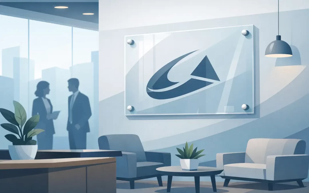
A visitor forms an opinion before they reach the front desk. A faded paper logo, a crooked wall graphic, or a bare reception area can make an otherwise capable business feel temporary. Acrylic office lobby signs give that first moment the polish it deserves – with clean lines, dimensional depth, and a finish that says your business is established and ready to serve.
For offices, hotels, real estate firms, medical practices, restaurants, agencies, and corporate spaces, acrylic is a practical way to turn a blank wall into a branded arrival point. The right sign does more than display a logo. It sets expectations for the customer experience, helps guests orient themselves, and gives your team a space they are proud to walk into every day.
Why Acrylic Works in a Lobby
Acrylic has the crisp, elevated appearance many businesses want from glass, without the same weight, fragility, or installation challenges. Available in clear, frosted, white, black, and colored options, it works with minimalist office interiors, high-energy retail settings, and upscale hospitality environments alike.
Clear acrylic is especially popular for reception signage because it creates a floating effect. A logo printed directly onto the panel or applied in dimensional lettering appears to sit slightly away from the wall when mounted with standoffs. That small amount of depth adds visual authority without overwhelming the room.
Frosted acrylic offers a softer, more private look. It is a strong fit for law offices, wellness practices, medical offices, financial firms, and conference room identification. Opaque acrylic, meanwhile, creates high contrast and can carry bold colors exceptionally well. The best material choice depends on the room’s lighting, wall color, and how prominent you want the sign to feel.
Start With What the Sign Needs to Do
Before choosing a size or finish, decide on the sign’s job. A main lobby logo sign has different requirements than a suite directory, a reception desk panel, or interior wayfinding. Trying to make one panel perform every function can create a crowded, hard-to-read result.
A primary reception sign should usually focus on your business name, logo, and perhaps a short tagline. It needs strong visual hierarchy from several feet away. A directory or wayfinding sign needs clearer supporting information, such as department names, suite numbers, arrows, or floor locations. These pieces can share the same materials and brand colors while using different layouts for different jobs.
For businesses with multiple tenants, departments, or changing personnel, plan for updates early. A fixed full-color acrylic panel looks excellent, but it may not be the most economical choice if names or room assignments change frequently. In that case, a system with replaceable inserts, separate name plates, or layered components can reduce future replacement costs.
Choosing the Right Size and Placement
A beautiful sign that is too small for the wall will disappear. One that is too large can make a compact lobby feel cramped. Measure the usable wall area, then consider where a visitor naturally looks when entering. In most reception spaces, the strongest location is behind the reception desk or directly within the line of sight from the entrance.
The desk itself matters. A wide reception desk often calls for a wider horizontal sign, while a narrow wall may benefit from a vertical layout or individual dimensional letters. Keep the sign centered to the intended focal point, which is not always the center of the wall. If the desk is offset or the entrance is angled, the best placement may shift accordingly.
Viewing distance should guide type size. Visitors should be able to identify the business name quickly from the doorway. Fine print, long mission statements, and dense service lists generally belong in brochures, wall graphics, or digital displays rather than on the main lobby sign.
Lighting is another deciding factor. Direct sunlight can create glare on clear acrylic, while dim lobbies may need higher contrast or a lighter background panel. Take photos of the wall at the times of day when your space receives the most traffic. They help reveal reflections, shadows, nearby architectural features, and potential obstructions before production begins.
Acrylic Office Lobby Signs: Design Details That Matter
The strongest acrylic office lobby signs look intentional from every angle. That comes down to more than a logo file. Color, mounting, spacing, and finish all affect the final result.
Print color should match your established brand standards as closely as possible. If your logo uses a precise corporate blue, a generic screen capture is not enough for reliable color reproduction. Supply the best available vector artwork, brand guide, or approved color references. This reduces proofing delays and helps maintain consistency across your signs, business cards, presentation folders, window graphics, and event materials.
White ink is particularly useful on clear acrylic. Without it, some colors can appear translucent or lose impact against the wall behind the panel. A white underlayer can make printed colors appear more solid, while selective white ink can create contrast only where it is needed. This is a production detail worth discussing before you approve a proof.
Mounting hardware also changes the look. Polished metal standoffs create a professional dimensional effect and work well in contemporary offices. Hidden mounting can create a cleaner appearance, but it may require more precise installation. Adhesive mounting can be suitable for lighter panels and smooth surfaces, though it is not always the right choice for textured walls, humid locations, or signs that may need to move later.
If your logo includes very thin lines, small type, or transparent effects, ask for a production review. Some digital artwork that looks sharp on a monitor needs minor adjustments to remain readable at full sign size. That is where experienced design and print support can prevent expensive reprints.
Layered Signs Add Depth Without Adding Clutter
A single acrylic panel is clean and effective. Layered signage adds more presence when the space calls for it. For example, a clear backer panel can be mounted with standoffs while an opaque logo or raised lettering sits on its face. The resulting shadows and separation make the brand mark more noticeable, especially under directional lighting.
This approach works particularly well in executive offices, boutique hotels, sales centers, high-end retail stores, and professional service firms. It does cost more than a flat printed panel because it involves additional materials, fabrication, and installation planning. For a high-traffic customer-facing lobby, that added visual impact can be a smart investment.
There is also a case for keeping it simple. A small office with a clean, well-designed clear acrylic sign can look more credible than a large, overbuilt display packed with unnecessary copy. The goal is not to make the wall busy. The goal is to make the business immediately recognizable.
Plan for Installation Before Ordering
Sign production is only one part of the job. A polished result depends on knowing what is behind the wall, who will install the sign, and whether building management has requirements for drilling, hardware, or after-hours access.
Drywall, concrete, glass, wood panels, tile, and textured finishes all call for different mounting approaches. If the wall is concrete or masonry, allow extra time for installation. If the sign will be placed in a leased suite, confirm landlord rules before committing to drilled standoffs. For a temporary sales office, event suite, or pop-up space, removable mounting may be the more practical route.
When timing is tight, get measurements, photos, artwork, and approval contacts organized at the start. Sobe Express can help businesses move from concept to professionally produced signage quickly, but fast turnaround works best when the scope is clear and files are ready for review.
Make the Lobby Part of a Complete Brand Experience
Your lobby sign should not feel disconnected from the rest of the space. Carry the same visual language into door signs, conference room markers, window graphics, directional signs, branded folders, brochures, and business stationery. A consistent set of materials makes your operation look organized, whether visitors are checking into a Miami Beach hotel, touring a property, attending a corporate meeting, or stopping by a local service business.
For growing teams, consistency also protects your brand as more people order materials. Standardized logo files, approved templates, and repeatable sign specifications keep future orders on track without forcing employees to guess at fonts, colors, or dimensions.
Acrylic signage is not just decoration for the reception wall. It is a visible signal that your business pays attention to details. Start with the visitor’s view from the door, choose materials that fit the space and expected wear, and give the design enough room to make a confident first impression.
Recent Comments