
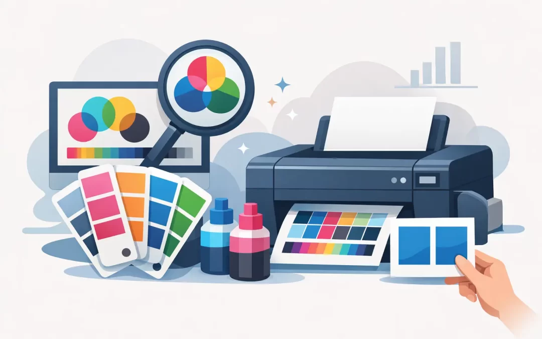
A deep navy that looks perfect on your monitor can arrive on a postcard looking almost black. A bright coral logo may print warmer on an uncoated menu than it does on a glossy brochure. So, can printers match colors? Yes, professional printers can match colors very closely, but an exact visual match across every screen, paper stock, ink process, and sign material is not always realistic.
For a business, the goal is not chasing a color that only exists on one laptop screen. The goal is consistent, recognizable brand color that looks professional wherever customers see it: business cards, brochures, presentation folders, retail signage, banners, window graphics, and event displays. Getting there starts with knowing what affects color before your job goes to press.
Can Printers Match Colors Across Every Material?
They can match a specified color within the limits of the print process and the material being printed. That distinction matters. A color printed with ink on bright white coated cardstock will not reflect light the same way that the same color does on kraft paper, clear vinyl, fabric, foam board, acrylic, or aluminum.
Paper is part of the color result. Glossy and silk stocks tend to make colors appear sharper and more saturated. Uncoated paper absorbs more ink, often creating a softer, more muted appearance. A warm white paper can shift pale grays, creams, and blues. If your brand depends on a crisp white background or a subtle pastel palette, stock selection deserves as much attention as the artwork.
Large-format products introduce another variable. Banners, wall graphics, and window graphics are viewed from farther away and under changing light. A color can be technically accurate while appearing different in a sunny storefront, a hotel lobby, or a dimly lit event venue. That is why production decisions should reflect where and how the finished piece will be used.
Why Screen Colors and Printed Colors Differ
Monitors create color with light. Printing creates color with ink, toner, or pigment on a physical surface. Screens use RGB – red, green, and blue light – while most commercial printing relies on CMYK – cyan, magenta, yellow, and black. RGB has a wider range of bright, luminous colors than CMYK can reproduce.
This is the source of many surprises. Electric blues, intense greens, neon tones, and highly saturated pinks often look brilliant on screen but need adjustment to print predictably. Converting an RGB file to CMYK at the last minute can change those colors, sometimes more than expected.
Screen settings also vary. One person may review a design on a phone with boosted brightness, another on an uncalibrated office monitor, and a third on a tablet set to a warmer display mode. None of those screens is a reliable contract proof. For an important campaign, use a defined print color specification and review a physical proof when practical.
CMYK, Pantone, and Brand Color Specifications
CMYK is the standard four-color process used for most full-color business printing. It is efficient, flexible, and ideal for photo-rich flyers, postcards, brochures, and marketing materials that use multiple colors. A CMYK recipe gives the production team a starting point, but the final look can still vary by press, paper, coating, and run conditions.
Pantone Matching System colors, often called spot colors, are premixed inks designed to create more controlled, repeatable color. They are especially useful for a signature logo color that must hold up across recurring stationery, packaging, signage, and promotional pieces. A Pantone color is not automatically the right choice for every job, however. It may add cost, may not be available for every digital or wide-format process, and will still look different on different substrates.
The strongest brand standards include more than a logo image. They identify approved Pantone colors where applicable, CMYK builds for process printing, RGB values for digital use, and sometimes hexadecimal values for web applications. They also define acceptable alternate colors for dark backgrounds, one-color printing, and specialty materials.
Start With a Print-Ready File
Color matching gets harder when the file is built without print in mind. Providing a print-ready PDF with the right color settings gives the production team a much better foundation than sending a screenshot, an RGB social media graphic, or a low-resolution image pulled from a website.
For standard commercial print, build artwork in CMYK unless your printer directs you otherwise. Keep logos as vector artwork when possible. Vector files preserve clean edges and allow solid colors to reproduce more reliably than compressed raster images. If photographs are part of the design, use high-resolution images sized for the final product.
Be careful with rich black. A plain black business card headline often prints best as 100% black, while a large black background may need a richer CMYK build to avoid looking washed out. The correct build depends on the press and stock, so it is worth asking before approving a large run. Small type reversed out of a rich black area can also create registration risks if it is too thin.
If your design uses transparency, gradients, metallic effects, or very light tints, request a file check. These elements can be beautiful, but they demand more attention than a simple one-color logo. A production team can spot issues before they become hundreds of unusable pieces.
When a Physical Proof Is Worth the Time
Not every order needs a proof. A straightforward reorder of familiar business cards, a standard flyer with approved brand colors, or an internal handout may move quickly with a digital proof and established production settings. When speed matters, that efficiency helps.
A physical proof is the smart move when color is central to the purchase decision. Consider one for a new brand launch, a premium real estate brochure, a hospitality menu, retail packaging, a major event display, or a large run that will be distributed across multiple locations. It is also valuable when moving an existing design to a new stock, finish, or format.
A proof gives you a chance to evaluate more than color. You can see whether small text is readable, whether photos retain detail in shadows, whether a gloss finish creates the effect you want, and whether your logo has enough contrast against its background. Review it under lighting similar to the final environment, not only under office fluorescents.
Use a Real Reference, Not a Memory
If you are trying to match an existing item, bring or send a clean physical sample. A previous brochure, product label, paint chip, or approved business card gives the print team a concrete reference. Keep in mind that older samples may have faded from sunlight or changed after years of handling, so they should be used as a guide rather than unquestioned proof.
For corporate teams, approved templates and centralized ordering reduce avoidable variation. When employees order from the same protected files, use the same logo assets, and follow the same approval process, brand color stays more consistent than it would through a collection of independently created documents.
Material and Finish Change the Perceived Color
A color match is not only about ink values. Finish changes perception. Gloss coating can increase contrast and make colors appear more vivid. Matte finishes reduce glare and often feel more refined, but may make deep colors seem less intense. Soft-touch laminates add a premium feel, while the underlying color may read slightly differently than it does on uncoated stock.
White ink is another consideration for clear, metallic, dark, or colored materials. Without a white underbase, printed colors can take on the color of the material beneath them. This can be a striking design choice for window graphics or specialty signs, but it should be intentional.
Outdoor graphics need practical color decisions too. Sun exposure, weather, and viewing distance all affect long-term appearance. A pale yellow detail that looks elegant up close may disappear from the street. A slightly bolder, higher-contrast version can perform better for wayfinding, storefront promotions, and event signage.
Get Reliable Color Without Slowing Down Your Project
The fastest route to dependable color is early clarity. Tell your printer whether a logo color is brand-critical, whether you are matching an earlier piece, what material you expect, and where the product will be displayed. Those details help the team recommend the right process before production is underway.
At Sobe Express, that hands-on production support is especially useful when a fast-turnaround order cannot afford guesswork. A quick review of files, stock, finish, and proof expectations can protect both your deadline and your brand presentation.
Your printed materials do not need to match every screen pixel to make an impact. They need to look intentional, consistent, and true to the brand customers recognize. Bring a clear reference, choose the right material, and approve the right proof for high-visibility work – then your color will be working for the business, not against it.
Recent Comments