
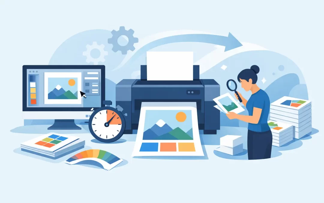
A business card with a cut-off phone number, a banner with blurry logos, or a flyer that prints darker than expected can slow down an otherwise urgent order. Knowing how to prepare print files before uploading keeps your project moving, protects your brand, and helps production start without avoidable revisions.
Whether you are ordering postcards for a real estate listing, menus for a Miami Beach restaurant, event signage, or a corporate presentation folder, the same production basics apply. A print-ready file gives the production team exactly what it needs: the correct size, enough bleed, high-resolution artwork, proper color settings, and a final proof you have reviewed carefully.
Start with the Finished Size
Set up your file at the final trimmed size of the product, not at a scaled-down version. If you are ordering standard 4 x 6 postcards, build the document at 4 x 6 inches before bleed. For an 8.5 x 11 flyer, start at 8.5 x 11 inches. This simple step prevents proportion issues, unexpected resizing, and soft images.
Large-format projects follow the same rule, with one practical exception. Posters, retractable banners, window graphics, and wall displays may be designed at full size or at a reduced scale, depending on the file and software. If you design at half scale, every element must be half scale, including image resolution and bleed. A 24 x 36 poster built at 12 x 18 inches is workable only when it is intentionally prepared for 200 percent output.
If your project includes folds, pockets, die cuts, or specialty finishing, use the product template whenever one is available. A tri-fold brochure is not simply three equal panels. The inside fold panel is often slightly narrower so the piece closes cleanly. Presentation folders, door hangers, and custom-shaped products also require precise dielines that should never be moved or altered.
Add Bleed and Keep Important Content Safe
Bleed is the extra artwork that extends beyond the final cut line. It is what allows a background color, photo, or pattern to reach the edge of a finished card or flyer without leaving a thin white border. For most commercial print jobs, extend edge-to-edge artwork at least 0.125 inches beyond every side.
For example, a 4 x 6 postcard with full-color artwork should be submitted at 4.25 x 6.25 inches when 0.125-inch bleed is included. The finished piece is still trimmed to 4 x 6 inches, but the extra image area gives the cutter room to work accurately.
Bleed does not mean placing all content near the edge. Keep phone numbers, web addresses, logos, legal copy, QR codes, and faces inside a safe area, usually at least 0.125 inches from the trim line. For banners and signs, leave more room around grommets, hems, frames, or hardware. A beautiful design can lose impact quickly if a key message lands too close to a finished edge.
Use CMYK Color for More Predictable Output
Screens display color in RGB, using light. Commercial printing typically uses CMYK, built from cyan, magenta, yellow, and black ink or toner. That difference explains why an electric blue on a monitor can look more restrained on a printed brochure.
Set your document to CMYK before exporting whenever possible. Convert placed images to CMYK as well, especially when brand colors and product photography need to reproduce consistently. RGB files can still be converted during production, but the conversion may shift bright greens, vivid blues, and fluorescent-looking colors more than you expect.
There is a trade-off with logos and brand standards. If your organization requires a specific Pantone color, use the designated spot color and select a printing method that supports it. If the job is full-color digital or four-color process printing, expect a close CMYK match rather than an exact Pantone ink match. For brand-critical materials, a proof is worth the extra attention.
Also watch rich black. Large black backgrounds often look deeper when built from multiple CMYK values rather than black ink alone. Small body text, thin lines, and fine type should generally use 100 percent black only. Rich black text can create registration issues and appear fuzzy at small sizes.
Check Image Resolution Before You Export
A high-quality photo downloaded from a website is not automatically a high-quality print image. What matters is effective resolution at the size it appears in the layout. For brochures, business cards, postcards, and other close-viewed marketing pieces, aim for 300 pixels per inch at final size.
An image that looks sharp at two inches wide may become blurry when enlarged to eight inches. Enlarging a low-resolution file in design software does not create new detail. It only spreads the existing pixels over a larger area. Start with the best original image available, particularly for property photos, food photography, product shots, and logos.
Large-format printing is more flexible because viewers stand farther away. A building banner does not always require 300 ppi at full size, but it still needs enough resolution for its intended viewing distance. If a file is questionable, ask before production rather than assuming it will print cleanly.
Handle Fonts, Logos, and Small Details with Care
Fonts are a common source of last-minute file problems. If the printer does not have the exact typeface used in your design, the software may substitute another font and change line breaks, spacing, or the overall look. The most dependable solution is to package your working files with fonts included or convert final text to outlines after all edits are complete.
Outlining type has a downside: text is no longer editable. Save an editable version first, then create a separate print-ready PDF with outlined fonts if required. For long documents, such as booklets or multi-page presentations, embedding fonts in a high-quality PDF is often the better approach.
Use vector artwork for logos, icons, line art, and QR codes whenever possible. Vector files stay sharp at nearly any size, making them ideal for business cards, acrylic signs, vehicle magnets, and trade show graphics. Avoid rebuilding a logo from a small screenshot or pulling one from a social media profile. It may look acceptable on screen but print with rough edges.
Be realistic about tiny elements. Fine white text reversed out of a dark background, hairline rules, and very small QR codes can be difficult to reproduce reliably. Increase the size or thickness where you can. A slightly bolder design is usually more effective than a technically delicate one that disappears in print.
Build the Right PDF for Production
A press-ready PDF is usually the most efficient file format for commercial printing. Export your final artwork as a high-quality PDF with crop marks only when requested, bleed included, fonts embedded or outlined, and images preserved at appropriate resolution. Avoid sending a flattened screenshot, a low-quality email PDF, or a document that has been repeatedly saved and compressed.
Before uploading, review the PDF itself – not just the source file. Open it at 100 percent and inspect every page. Check that backgrounds extend into the bleed, page counts are correct, and no hidden layers, comments, placeholder text, or outdated pricing remain. For double-sided pieces, verify orientation. A back side that is rotated incorrectly can create a costly reprint.
For variable data projects, such as business cards for multiple employees or direct-mail postcards with different names and addresses, confirm the spreadsheet fields and final records before release. Consistent file naming also helps keep fast-turnaround orders organized. Use a clear name such as `Summer_Event_Postcard_4x6_FINAL.pdf` instead of `finalfinal2.pdf`.
Review the Proof Like It Is the Finished Piece
A proof is your last opportunity to catch content issues before production. Read every word, even familiar copy. Confirm dates, suite numbers, phone numbers, prices, sponsor logos, event times, and QR code destinations. Scan the design from a customer perspective: Can someone understand the offer in a few seconds? Is the call to action easy to find?
For urgent projects, it can be tempting to approve quickly. Speed matters, but an extra two minutes spent reviewing the proof can prevent an entire run of unusable materials. If something feels uncertain – color, size, fold placement, image quality, or finishing – ask for guidance before approval. In-house design support is often the fastest route when a file needs repair rather than a complete rebuild.
Strong print files are not about mastering every technical setting. They are about making a few production-smart decisions early, so your cards, flyers, signs, and displays arrive looking as polished and purposeful as the business behind them.
Recent Comments