
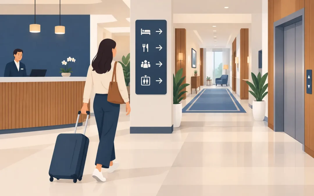
A guest should not have to stop in the lobby, scan the room, and ask where the elevator is. Effective hotel signage answers that question before it becomes a service issue. It directs traffic, reinforces your property’s personality, improves accessibility, and helps every part of the guest experience feel more organized.
For hotels, resorts, boutique properties, and short-stay accommodations, signs are not background décor. They are working tools. From the first parking instruction to the final checkout reminder, each sign should make the next step obvious.
Start Hotel Signage With the Guest Journey
The strongest sign plan follows the way guests actually move through a property. A beautiful lobby sign has value, but it cannot carry the full job on its own. Guests need clear direction at the parking entrance, front desk, elevator bank, hallway, pool gate, breakfast area, restrooms, and event spaces.
Walk the property as if you were arriving for the first time. Where would a guest hesitate? Where might a family carrying luggage turn the wrong way? Which doors look private but are actually public, or vice versa? Those are the moments where signage earns its place.
Start with the high-traffic decisions: entrance and parking, check-in, elevators, guest rooms, amenities, exits, and meeting areas. Then address smaller but still meaningful touchpoints, such as ice machines, laundry rooms, vending areas, pet relief zones, smoking restrictions, delivery instructions, and staff-only access.
A sign does not need to explain everything. It needs to give the right instruction at the right point. If guests have already passed the turn before they see the sign, the message arrived too late.
Give Each Sign One Clear Job
A common mistake is asking one sign to do too much. A wall-mounted panel that includes a property map, pool rules, restaurant hours, shuttle times, Wi-Fi details, and promotional offers may look busy before a guest reads a single word.
Separate operational directions from promotional messaging. Wayfinding signs should be fast to read. Promotional signs can have more personality and detail when guests are standing still, such as at the front desk, in an elevator, or near a lounge area.
For example, an arrow reading “Guest Elevators” should be large, direct, and placed before the decision point. A nearby tabletop sign can promote late checkout, spa services, a rooftop event, or an in-house restaurant special.
Build a Consistent Hotel Signage System
Consistency makes a property easier to navigate. It also protects the brand experience. When one hallway uses black acrylic plaques, another uses printed paper inserts, and a third uses a different typeface, guests notice the disconnect even if they cannot explain it.
Your sign system should establish a repeatable look for room numbers, directional signs, amenity markers, safety notices, and temporary displays. Use the same core colors, typography, icon style, and mounting approach wherever practical.
This does not mean every sign must look identical. A luxury hotel may use dimensional letters and brushed aluminum in public spaces, then use smaller acrylic room plaques on guest floors. A beachfront property may use weather-resistant aluminum outdoors and foam board or mounted signage for indoor event use. The materials can change based on the environment while the visual system stays recognizable.
Prioritize Readability Over Decoration
Hotel branding matters, but guests cannot follow a logo. Use strong contrast between the background and lettering, especially for direction signs and room identification. Small decorative fonts may fit a mood board, but they often fail in dim hallways, from a distance, or for guests with low vision.
Keep directional language simple. “Pool,” “Lobby,” “Fitness Center,” and “Restrooms” are better than clever labels that require interpretation. If your property serves international travelers, universally recognized icons can provide useful reinforcement, though text should remain clear on its own.
Consider viewing distance before approving a design. A sign above a corridor entrance needs larger lettering than a sign mounted beside a door. A room number should be readable from the hallway without a guest needing to stand inches away.
Choose Materials for the Actual Environment
The right material depends on where the sign will live, how long it needs to last, and how often information may change. Selecting the lowest-cost option for every application can create replacement costs and a less polished appearance later.
Acrylic signs work well for front desks, office doors, room markers, and interior directories. They offer a clean, professional finish and can be printed, layered, or paired with standoffs for a more dimensional look. Aluminum signs are a smart choice for outdoor areas, parking instructions, pool regulations, and other locations exposed to humidity, heat, and frequent cleaning.
Window graphics can turn unused glass into useful guest communication. Use them for entrance hours, check-in directions, restaurant promotions, privacy treatments, or temporary event branding. Banners are effective for high-visibility announcements, seasonal offers, conferences, weddings, and renovations, particularly when a message needs to be seen from farther away.
For temporary needs, foam board and mounted posters can be practical and budget-conscious. They are ideal for a weekend event, an overflow check-in desk, a conference schedule, or a temporary directional update. They are not the right substitute for permanent wayfinding in areas that see daily guest traffic.
Do Not Overlook Safety and Accessibility
Hotel signage must do more than look polished. It has to support safe, independent movement throughout the property. Accessible room identification, exit signs, restroom markers, and other required notices should be planned carefully from the start, not added as an afterthought.
Requirements vary by property type, location, and application. Work with qualified professionals when reviewing ADA-related signage, including tactile lettering, Braille, mounting height, contrast, and placement. A sign can contain the correct wording and still fail if it is installed in the wrong location or does not meet readable contrast standards.
Emergency information also deserves its own planning. Exit paths, stairwells, fire equipment, occupancy notices, pool rules, and restricted-access areas should be easy to find and difficult to misunderstand. These signs should never compete with marketing graphics for attention.
Make Room for Revenue Without Creating Clutter
A hotel has valuable opportunities to promote services after check-in. Guests may not know about a breakfast package, happy hour, valet option, retail display, cabana rental, meeting room, or local event unless the property puts the offer in front of them.
The key is placement. Promote breakfast near elevators in the evening and at the front desk during check-in. Promote spa services in guest elevators, room key packet areas, or near the fitness center. Promote event spaces and group packages where local visitors or corporate guests will see them.
Changeable displays are especially useful for properties with rotating offers. Poster frames, table tents, window graphics, retractable banners, and removable wall decals give hotel teams flexibility without requiring permanent signs for every campaign. Keep the number of messages under control. A few well-placed offers perform better than a lobby filled with competing calls to action.
Plan for Updates Before You Print
Hotels change. Hours shift, seasonal amenities open and close, construction affects routes, and event groups need temporary directions. A good sign program anticipates these changes.
For permanent signs, avoid printing details that are likely to change every few months. A sign that says “Fitness Center” will last longer than one that includes operating hours if those hours fluctuate. Place changing details on an adjacent insert, window decal, or smaller replaceable panel.
Create a simple inventory of recurring signs and keep approved artwork on file. That makes reorders faster when a room plaque is damaged, a directional sign needs updating, or a new amenity opens. For multi-property operators, approved templates also keep every location on brand while giving local teams room to update relevant information.
Sobe Express can support hotel teams with in-house design help and professionally produced acrylic signs, aluminum signs, window graphics, banners, posters, and event displays when timing matters. For qualifying local orders placed early, same-day in-store pickup can be a practical option when an event, inspection, or guest-facing update cannot wait.
A Better Sign Plan Starts on the Floor
Before ordering, print a basic property map and mark each point where a guest needs guidance. Then stand in those locations and test whether the proposed sign can be seen, read, and understood within seconds. This simple walkthrough catches problems that are easy to miss on a computer screen.
The best hotel signs do not ask guests to work harder. They quietly keep people moving, reduce repetitive questions at the front desk, protect the property’s image, and make every arrival feel more confident. When a guest finds the elevator, room, pool, or meeting space without pausing, the signage has done exactly what it should.
Recent Comments