
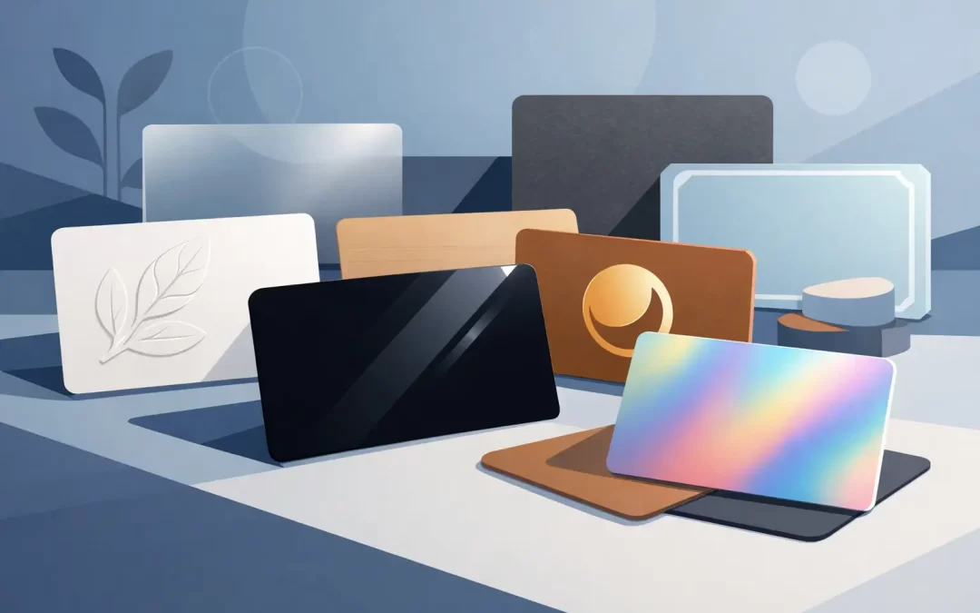
A business card gets handled in the few seconds after a handshake, at a crowded open house, or while a guest is deciding where to book dinner. That physical moment is why choosing the best business card finishes is not just a design decision. It is a decision about how your business feels before a customer calls, scans, or visits.
A finish can make bright brand colors look sharper, give a card a refined texture, or add a premium detail that helps it stay out of the trash. It can also work against you if it makes small type hard to read, shows fingerprints, or sends the wrong message for your market. The right choice depends on your brand, the environment where cards are shared, and how quickly you need to put them to work.
Start With the Job Your Card Needs to Do
Before choosing paper effects, think about the card’s real-world use. A luxury real estate agent handing out cards at private showings has a different need than a restaurant manager placing cards at the host stand. A nightlife promoter may want immediate color impact. A law firm may need understated authority. A contractor may need a durable card that still looks clean after days in a truck or jobsite bag.
Your design matters here too. Heavy photography, bold color blocks, fine text, metallic logos, and handwritten notes all respond differently to finishing options. The best finish supports the design instead of competing with it.
For most business buyers, the strongest options fall into four practical categories: matte, gloss, soft touch, and specialty finishes such as spot UV or foil. Each creates a distinct impression and comes with a trade-off in cost, writeability, color appearance, or production time.
Matte Business Card Finish: Clean, Versatile, Professional
Matte is a dependable choice for brands that want polish without flash. Its low-reflective surface reduces glare and gives colors a controlled, modern look. It is especially effective for consultants, attorneys, wellness brands, financial professionals, corporate teams, and businesses with clean, typography-led designs.
A matte finish also makes cards easier to read under bright indoor lighting or direct Miami sunshine. If your card includes a QR code, service list, appointment details, or several contact methods, that reduced glare can be a genuine advantage. Matte cards generally photograph well, too, which helps when your team shares branded materials on social media.
The trade-off is that deep colors may not appear as intensely saturated as they do on a glossy stock. Matte surfaces can also show scuffs more easily when cards are carried loose in a pocket or purse. For a dark, full-bleed design, ask for a proof and consider whether your logo or type needs more contrast.
Choose matte when you want an approachable, professional card that works across many settings. It is one of the best all-around business card finishes for organizations ordering cards for several employees because it stays consistent with a broad range of names, titles, and layouts.
Gloss Business Card Finish: High Color and Fast Impact
Gloss creates shine. It makes photographs, bold graphics, gradients, and vibrant colors feel more energetic. For restaurants, retail brands, entertainment venues, travel businesses, automotive services, and event teams, gloss can help a card create an immediate visual hit.
A food photo can look richer on gloss. A colorful product image can look more vivid. A tropical hospitality brand can use gloss to reinforce a bright, high-energy identity. When your goal is to make someone look twice, gloss is a smart contender.
But shine is not always premium. Under overhead lights, gloss can reflect enough light to make small text temporarily harder to read. It also tends to collect fingerprints, particularly on dark backgrounds. And if your team needs to write an appointment time, discount, or personal note on the card, standard pens may smear or fail to adhere well.
Gloss is best when your design relies on color and imagery, and the card will be handed out in clean, controlled settings. Use it with confident graphics and keep essential text high contrast. If your card needs room for handwritten notes, a matte finish or uncoated writing area may be more practical.
Soft Touch: A Premium Finish People Notice
Soft-touch lamination has a velvety, almost suede-like feel. It does not announce itself from across the room, but people notice it as soon as they hold the card. That tactile difference makes it a strong option for brands selling a high-value service or building one-to-one relationships.
This finish fits luxury real estate, boutique hospitality, beauty and aesthetics, architecture, premium retail, agency services, and executive-facing businesses. It can make a minimalist card feel intentional and expensive without relying on oversized logos or busy graphics.
Soft touch works particularly well with black, charcoal, navy, and other dark designs. Pairing it with a bright white logo, metallic foil, or raised spot UV can create a sharp contrast between a muted surface and a focal detail. The result is memorable, but not loud.
There are practical considerations. Soft-touch cards usually cost more than standard finishes, and they may not be ideal for high-volume giveaways where price per piece is the main concern. They can also show marks on very dark artwork if handled heavily. For a card handed to qualified clients, partners, or guests, that investment can make sense. For thousands of event handouts, matte or gloss may deliver better value.
Spot UV and Foil: Use Contrast With Purpose
Specialty effects are most effective when they highlight one element rather than cover the entire card. Spot UV adds a clear, glossy coating to selected areas, such as a logo, pattern, name, or headline. Foil adds metallic shine in colors such as gold, silver, rose gold, or other custom options depending on production specifications.
A raised or glossy logo on a matte card gives people a reason to touch it. Gold foil can reinforce an upscale hospitality brand or high-end property team. Silver foil can feel clean and technical for a design studio or professional services firm. Used well, these finishes turn a standard contact card into a branded keepsake.
The risk is overdoing it. Foil, spot UV, metallic ink, full-bleed photos, and multiple typefaces all competing on one card can make the piece feel busy rather than premium. Specialty finishing should direct attention to the most important brand element, not become the whole message.
It is also worth planning ahead. Specialty processes can involve additional setup and production steps, so they may not be the best choice for a same-day networking event or an urgent staff order. If speed is your priority, choose a high-quality standard finish and let strong design do the work.
Match the Finish to Your Industry and Distribution Plan
There is no single winner for every business. The best business card finishes are the ones that match how the card will be used.
For a high-volume promotion, gloss delivers bright visual energy at a practical price point. For office teams, professional services, and everyday networking, matte is usually the safest, most flexible choice. For relationship-driven premium brands, soft touch makes the card feel distinctive in hand. For selective client meetings, launches, and luxury presentations, spot UV or foil can create a stronger first impression.
Think beyond the handoff, too. Will the card sit inside a welcome packet, on a restaurant counter, in a sales folder, or in a pocket for several days? Will your recipient scan a QR code? Do your employees need to add a note? Is the card one part of a coordinated set with letterhead, presentation folders, postcards, or signage? The finish should support the complete brand experience.
Get the Design Ready Before Production
Finishing cannot fix a weak layout. Before printing, make sure your contact information is easy to scan, your logo has room to breathe, and your file includes proper bleed. Fine lines and small reversed text deserve extra attention, especially with foil or spot UV. A proof is the right time to catch an incorrect phone number, low-resolution image, or logo that is too close to the trim edge.
If you are unsure which finish fits your artwork, bring the question to the production stage instead of guessing at checkout. A hands-on print partner can help you weigh color, durability, budget, and turnaround before the job goes to press. Sobe Express helps Miami Beach businesses move from file to finished collateral with in-house design support and fast production options when the deadline is real.
Your card does not need every premium effect to make an impression. It needs the right finish, a clear message, and enough quality that the person holding it feels confident keeping it.
Recent Comments