
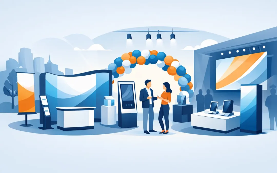
A crowded event floor gives every business the same challenge: people make a decision about where to stop in seconds. The right event displays make that decision easier. They put your name, offer, products, and personality in front of attendees before a sales conversation even begins.
For a Miami Beach hotel ballroom, a packed trade show, a retail pop-up, or a corporate meeting, the goal is not simply to print something large. Your display needs to be visible at the right distance, easy to understand, sturdy enough for the environment, and simple for your team to set up. When those details work together, your booth or activation looks prepared, credible, and worth visiting.
Start With the Job Your Display Must Do
Before choosing a banner size or a backdrop style, identify the one job each display needs to accomplish. Trying to put every message on one sign usually leads to clutter, smaller type, and missed opportunities.
A display at the front of your space should earn attention from across the room. A display inside the space should explain what you do or introduce an offer. Directional signs should tell visitors where to go without requiring them to ask. A photo backdrop should create a branded moment that guests want to share.
That distinction matters because a large step-and-repeat backdrop is excellent for photos but not always the best choice for communicating pricing or a detailed service menu. A retractable banner can deliver a focused message near an entrance, but it cannot replace the visual impact of a full booth backdrop. Build your display plan around the attendee journey: notice, approach, understand, engage, and remember.
Event Displays Need a Clear Viewing Hierarchy
People do not read displays the way they read brochures. They scan from a distance, often while walking, talking, or looking for their next appointment. Your most valuable message has to be understood quickly.
Lead with one strong headline. It might name the product, state the event offer, or answer the problem your customer came to solve. Follow it with a short supporting line and one clear call to action. Save technical details, long lists of services, and dense copy for a handout, presentation folder, or conversation with your staff.
Your logo should be visible, but a logo by itself rarely gives attendees a reason to stop. Pair your brand with a customer-focused message. “Luxury Property Management” identifies a category. “Fill Vacancies Faster With Full-Service Property Marketing” gives a prospect a reason to engage.
Color and contrast do much of the work. Light text on a busy image may look polished on a monitor but become difficult to read under venue lighting. Use high contrast for headlines, avoid overly thin typefaces, and leave enough open space around key messages. A display does not need to be crowded to look premium. In most cases, less copy creates more impact.
Choose the Right Format for the Space
The best display format depends on the venue, available footprint, audience flow, and how often your team will use it. A flexible mix often outperforms one oversized piece.
- Retractable banners are practical for lobbies, conferences, registrations, and sales presentations. They travel easily, set up quickly, and work well for focused messages.
- Fabric backdrops and tension displays create a polished branded wall for booths, photo opportunities, panels, and presentations. They are ideal when your brand needs a larger visual presence.
- Foam boards and rigid signs work well for schedules, menus, wayfinding, check-in instructions, and promotional messaging. They are especially useful when information needs to be positioned on an easel or tabletop.
- Table throws and tabletop displays turn a standard event table into branded real estate. They help smaller spaces look intentional without adding a complicated setup.
- Outdoor banners and signs support grand openings, festivals, waterfront events, and sidewalk promotions. For outdoor use, material selection, mounting, wind exposure, and local venue rules all need attention.
If your booth is compact, prioritize height rather than adding more pieces at floor level. A vertical banner or backdrop can be seen over nearby tables. If you have a larger footprint, use separate displays to create zones: one to attract people, one to explain the offer, and one to support conversations or demonstrations.
Design for the Venue, Not Just the Screen
A great file can still fail when it is designed without the real environment in mind. Exhibit halls have competing visual noise. Hotel ballrooms may have warm, dim lighting. Outdoor events have glare, wind, and long viewing distances. Retail activations may need to match an existing store layout.
Ask where your display will be placed and what attendees will see around it. If every neighboring booth uses blue and white, a similar palette may blend into the background. That does not mean abandoning your brand colors. It means using contrast, photography, accent colors, and layout more strategically.
Also consider the distance between your display and the viewer. A headline intended for ten feet away should be much larger than copy read at arm’s length. QR codes need sufficient size, clear contrast, and a little breathing room so guests can scan them quickly. If a QR code leads to an event-only offer, make the value clear beside it. “Scan for our show special” works better than a code with no context.
High-resolution images are essential, especially on large-format graphics. A small web image may look acceptable on a laptop but appear soft or pixelated at backdrop size. When you are working against a deadline, involving a professional design team early can prevent rushed revisions, incorrect sizing, and avoidable reprints.
Make Setup Part of the Buying Decision
The display that looks best is not always the right display if it takes an hour to assemble and your event team has ten minutes before doors open. Setup requirements are a real business consideration, especially for teams handling multiple locations or frequent events.
Consider who will transport the display, whether it must fit in a car, how many staff members will be on-site, and how often the message may change. Retractable banners are efficient for recurring use. Replaceable graphic systems can be a smart investment for campaigns that change often. Rigid signs are fast and cost-effective for short-term messaging, but they require more care during transport.
Do not forget the small operational details: carrying cases, hardware, venue approval requirements, power access near digital components, easels, weights for outdoor signs, and backup materials. A branded tablecloth, a few directional signs, and a clean check-in board can make a basic setup feel far more complete.
Build Consistency Across Every Touchpoint
Your event display should not feel disconnected from the materials your team hands out. When the same colors, fonts, offer, and key message appear on banners, flyers, business cards, brochures, and presentation folders, attendees are more likely to recognize your brand after the event.
Consistency is especially valuable for corporate teams, franchises, multi-location businesses, and agencies managing repeated events. Approved templates help local teams order what they need while keeping the brand intact. They also reduce last-minute design decisions when a new event appears on the calendar.
At Sobe Express, businesses can combine large-format display production with the supporting print materials that turn a quick booth visit into a sales opportunity. That means fewer vendors to manage when time is short and brand consistency matters.
Plan Earlier Than You Think You Need To
Event deadlines rarely move in your favor. Booth assignments change, sponsorships get confirmed late, and someone eventually realizes the old banner has an outdated logo or message. The earlier you identify the display strategy, the more choices you have in materials, finishes, design, and budget.
Still, urgent needs happen. If you need a fast turnaround, simplify the message rather than rushing a complicated design. Use proven formats, provide the best available artwork, confirm final dimensions, and check your proof carefully. A direct message printed well and delivered on time will outperform an ambitious display that arrives late or creates confusion.
The display is the opening move, not the whole event strategy. Give people a reason to notice you, make it easy to understand what you offer, and equip your team with printed materials that keep the conversation going after the room clears.
Recent Comments